Challenge
Tork is the world's leading brand in professional hygiene products and services for restaurants, offices, schools, and industrial settings.
Every year, the company holds an innovation and business convention for employees and partners, where new technologies, advancements, and results are presented. In addition, workshops and presentations focused on learning and collaboration are held.
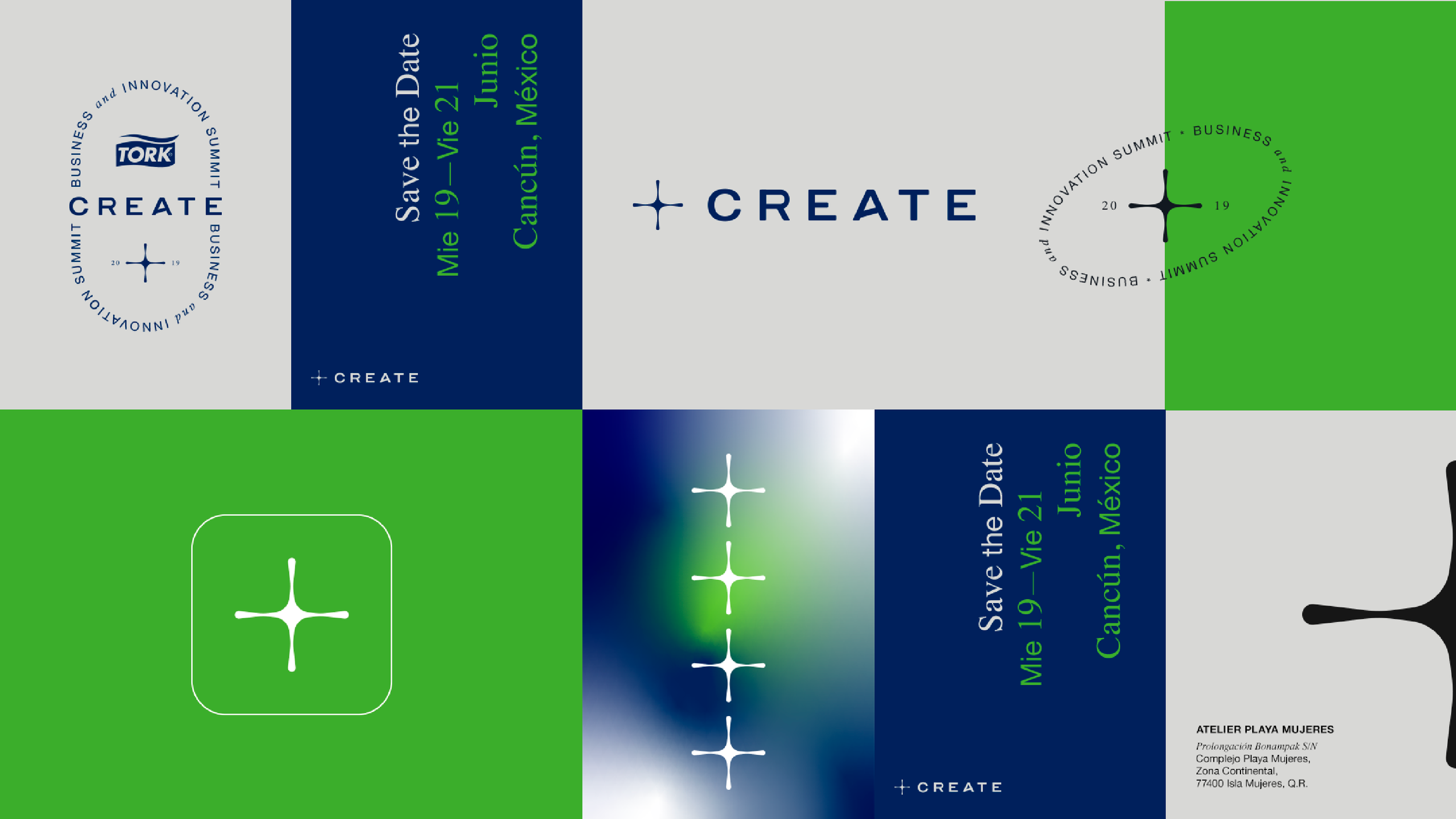
The challenge was to create a straightforward, tech-driven visual identity by developing a flexible and scalable design system that could be consistently applied across various physical and digital formats.
Solution
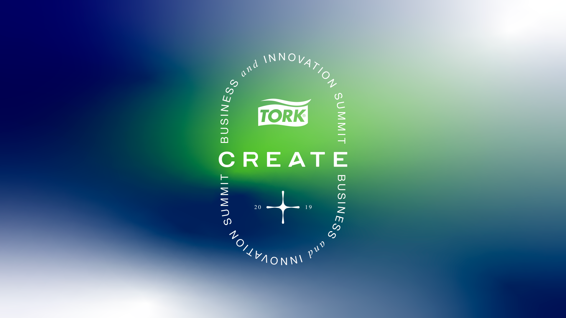
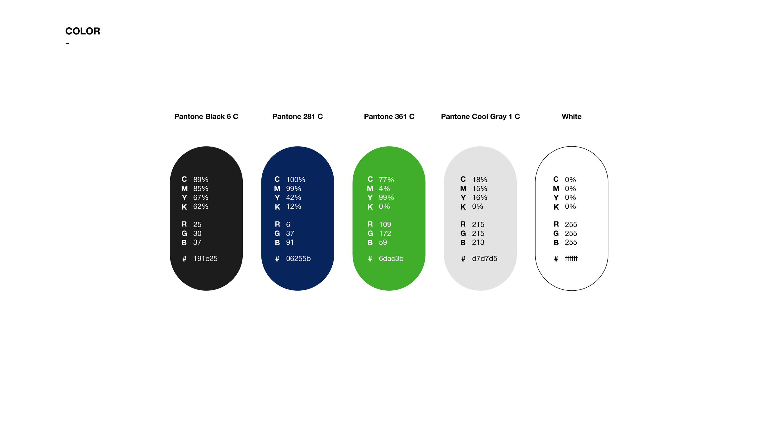
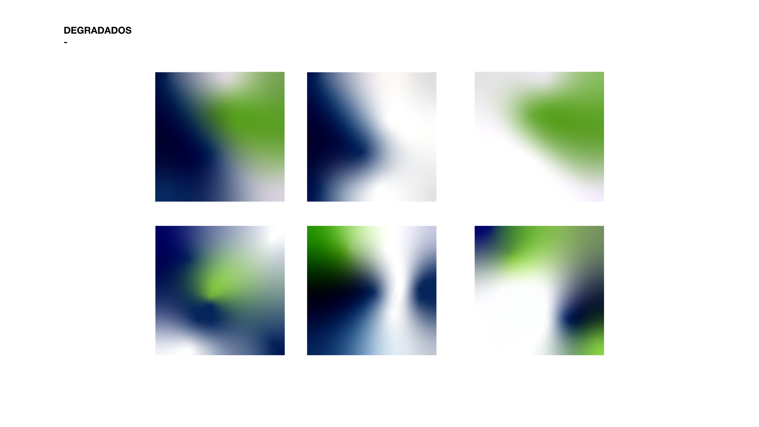
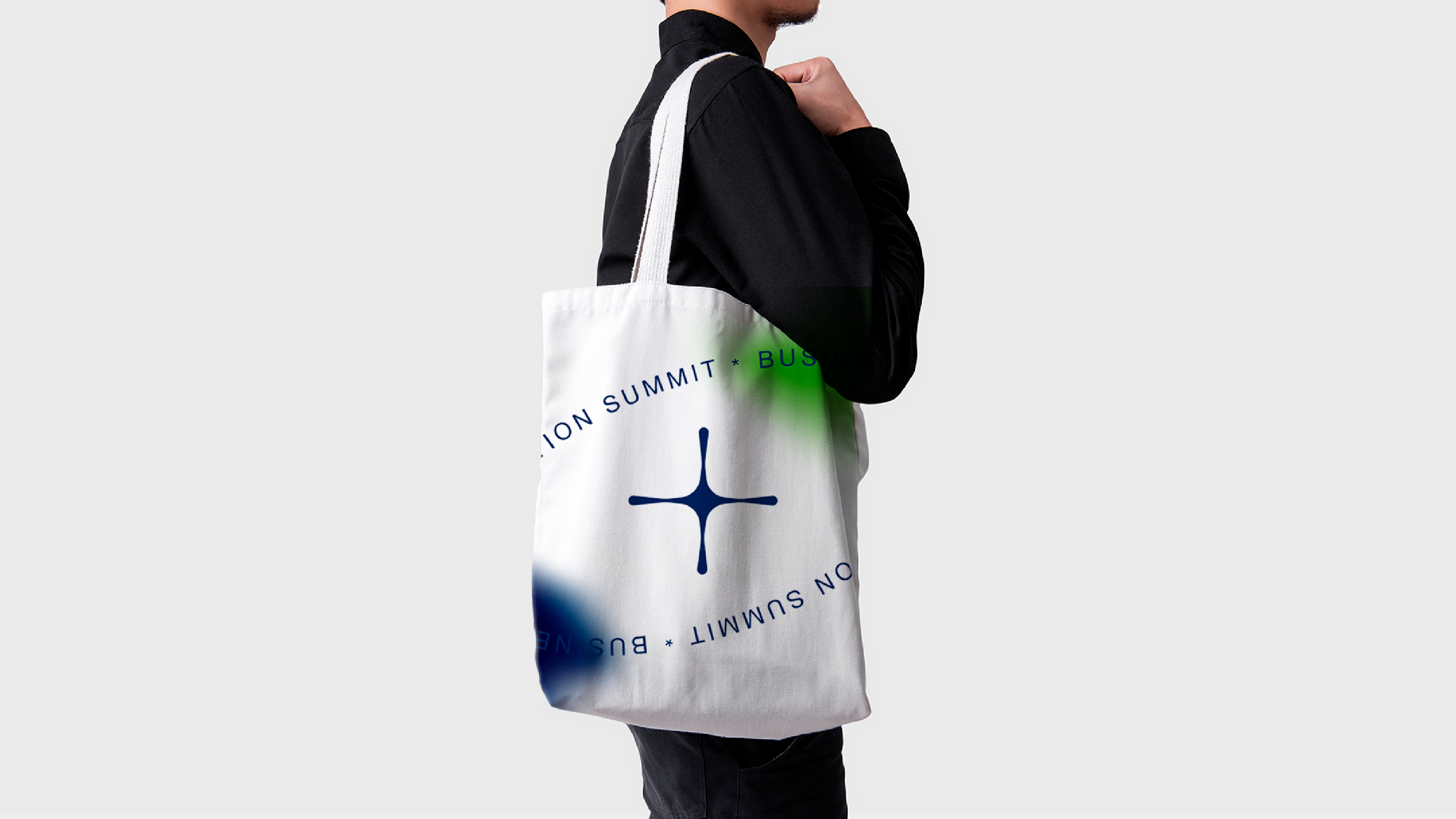
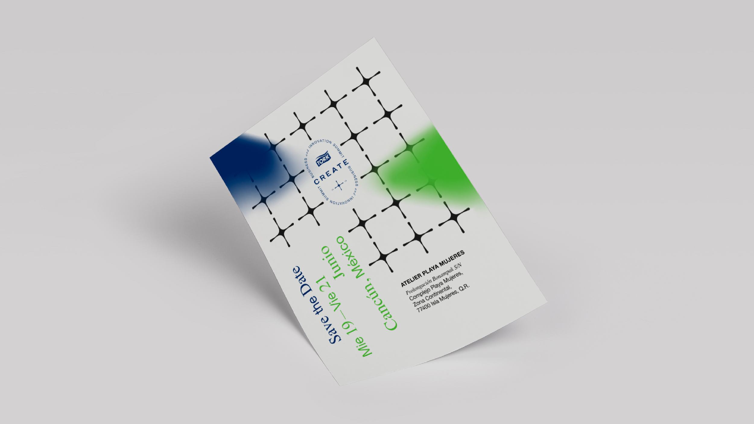
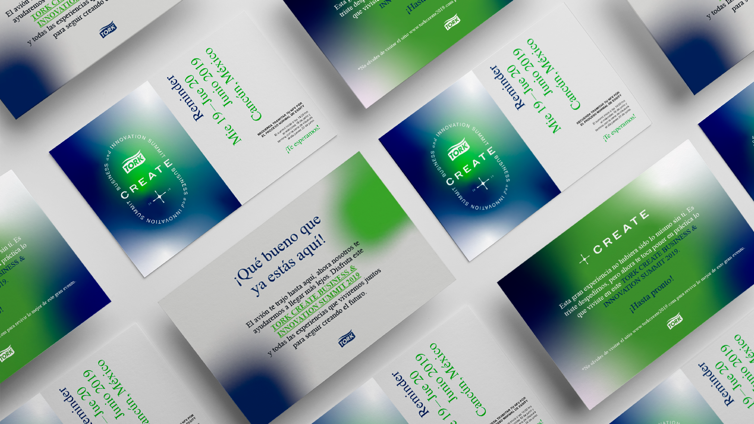
We created a visual, dynamic, and consistent system using a color palette aligned with the brand; the colors set the brand apart and help build consistent brand expressions.
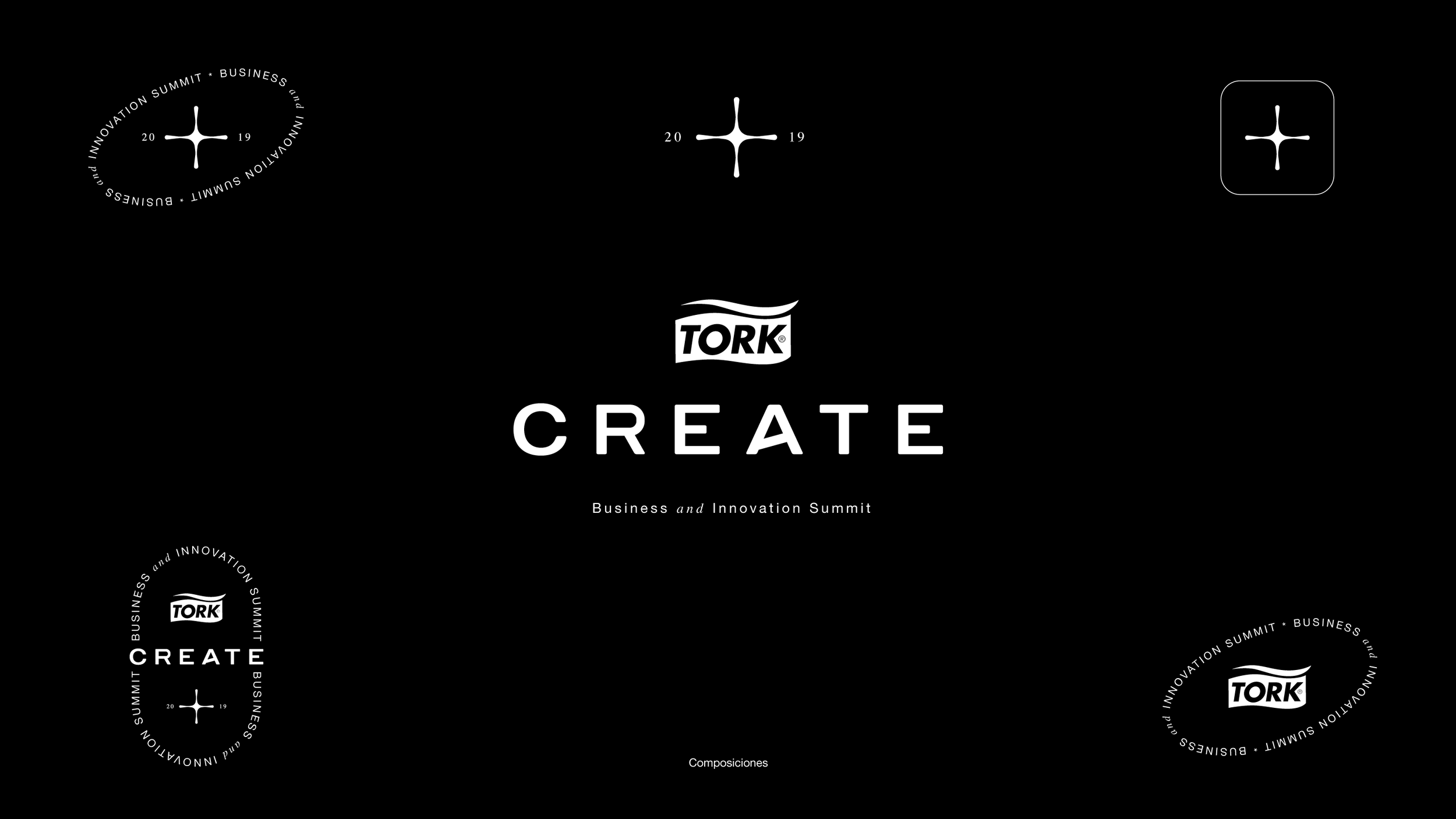
The logo is straightforward, responsive, and dynamic. The typographic selection plays a key role in the design system; the primary typeface is sans serif, conveying timelessness, technology, and order. In contrast, a serif typeface was chosen as an accent to balance the typographic weight.
-
Desafío
Tork es la marca líder mundial en productos y servicios de higiene profesional, desde restaurantes, oficinas, escuelas e industrias.
Cada año se realiza la convención de innovación y negocios para empleados y colaboradores, donde se presentan nuevas tecnologías, avances y resultados. Además, se realizan workshops y ponencias enfocadas en el aprendizaje y colaboración.
El reto consistió en crear una identidad visual directa y tecnológica, desarrollando un sistema de diseño flexible y escalable, aplicable de forma consistente en distintos formatos tanto físicos como digitales.
Solución
Creamos un sistema visual, dinámico y consistente por medio de una selección cromática alineada con la marca, los colores distinguen a la marca y ayudan a construir expresiones de marca consistentes.
El logotipo es directo, responsivo y dinámico. La selección tipográfica juega un rol clave en el sistema de diseño, la tipografía principal es Sans Serif, transmite atemporalidad, tecnología y orden, por otro lado, en contraste se eligió una Serif como acento para equilibrar el peso tipográfico.
Client: Tork
Line of bussines: Hygiene
Services: Art Direction
Design: HeyYet
Collaboration: We Agency